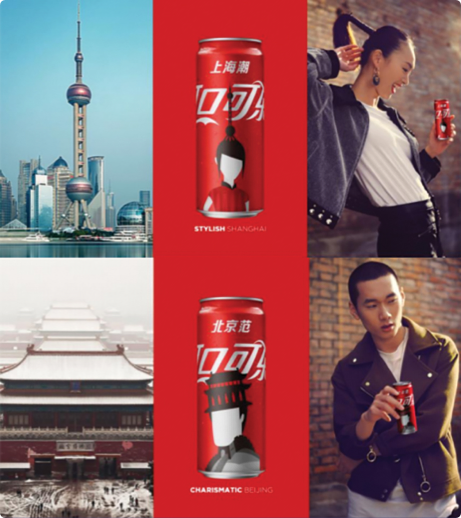


When you translate copy, you have to understand the local culture. You can’t rely on transliteration. You do, however, need to comprehend how people feel about your messaging and brand.
‘Drink Coke’ works. Because consumers have been exposed to it everywhere from billboards in Madrid to lit-up signs in Piccadilly Circus. But when you start using metaphors, like ‘a thirst for success’, things can go quite wrong. “What do you mean? I have to drink this to be successful?”
And that’s exactly the kind of unwanted sentiment we try to avoid at Creative Translation.

To create recruitment advertising, on and off line, candidate packs, banners, calling cards, posters and flyers, we conducted workshops with country managers and our own linguists and copywriters. There, we established common ground and got the messaging right – without compromising their message. It resulted in compelling communications in a range of European and Scandinavian languages that befitted the Coca-Cola brand.
As well as the translation service itself, we implemented a system that removed bottlenecks, reduced costs and sped the project to market. Our copywriters and linguists worked with the country marketing managers rather than against them.
We’ll drink to that.
This page demonstrates the various typographic styles that are available within WordPress editor fields. As you can probably see, this is a basic paragraph of text. Within it you can include hyperlinks to other pages. When doing so, the link text should always be descriptive of the page that you are linking to.
This next paragraph includes‚ emboldened text‚ and also some text‚ set in italics. You can also set‚ text to be both emboldened and italicised‚ if you wish. We can also use this paragraph to test underlined text. Obviously, you’d not want to use underlined text as it makes text looks like a hyperlink. Finally, we can also set some text with strikethrough to check that that style works too. Before we take a look at heading styles, let’s just check that the Blockquote style is working:
this is a new blockquote.
This section of text is prefaced with a Heading 3. We’ll stick in some Latin text just to bulk the paragraph out a bit. Lorem ipsum dolor sit amet, consectetur adipiscing elit. Pellentesque sapien metus, faucibus eget massa vel, dictum suscipit mauris. Proin tempor metus est, vel aliquet risus pharetra sed. Curabitur nec semper nisi, vitae egestas turpis. Nunc sit amet magna dignissim tortor suscipit dignissim.
Now let’s add a horizontal line below this paragraph to check that they are working.
Gosh, we’re at a level 4 Heading already. That means that this paragraph should only contain text that is supportive of the main content as opposed to being of high significance to it. While we’re here, we’ll take a quick Ok, we’re making good progress but we still have a few more default WordPress styles to look at.
We’re really getting to the least important heading styles now. Unlike H1, H2 and H3 headings, H4, H5 and H6 are unlikely to be considered by search engines when evaluating a page of content. Therefore, they should only be considered for presentation styles as opposed to SEO significance. However, while we’re here, let’s look at an unordered list, often known as a bullet list.
Obviously there will be times when you need an ordered list, also known as a numbered list. For those situations you need the HTML <ol> tag with ol standing for Ordered List:
With that all sorted, we’ll take a quick look at H6 and the last few styles.
As you can see, we usually use heading 6 for small print. It’s of such minor importance that it is unlikely to be used by search engines as part of the ‘on page’ SEO quality of a page. Therefore, why not use it as a presentational style?